Structure and GSC Data Integration
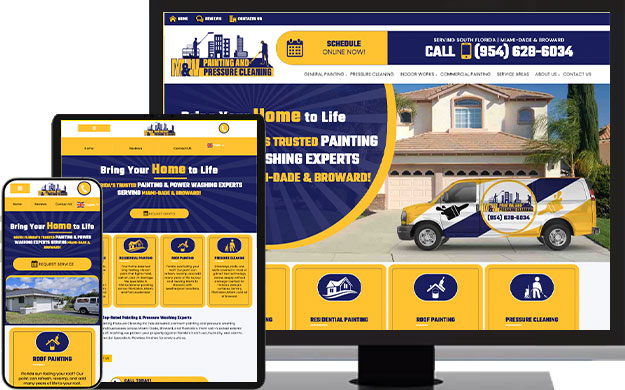
The designs included variations for mobile, tablet, and desktop screens. I optimized the designs to meet the specific needs of each user and screen size.
Improving user experience on all media queries.
- Project type: End-to-end web application + branding
- Role: UX/UI designer + brand designer
- Industry: Commercial and residential painting, general remodeling and Pressure Cleaning.
- Content: Created with AI focused with SEO friendly for the different services, including meta and title tags.

The Goal: Quality Over Quantity
The goal of this case study is to use the numbers to tell a story about quality over quantity
1. Project Overview & The Challenge
M & W Painting Pressure Cleaning Inc. located in Miami, FL. They offer free painting and pressure cleaning services to commercial and residential buildings.
Client: M & W Painting Pressure Cleaning Inc. https://mwpaintingpressurecleaninginc.com
My Role: Website Development, Graphic Design, and SEO Strategy.
The Initial Problem: Clearly state the starting point. The site was getting a high number of impressions but a very low click-through rate (CTR), indicating poor quality targeting, ineffective titles/descriptions, or a poor user experience/site structure that Google was struggling to crawl.
| Metric | Start Date (2025-06-10) | End Date (2025-12-09) |
|---|---|---|
| Clicks | 1 | 3 |
| Impressions | 1,698 | 176 |
| Calculated CTR | $0.06% | 1.70% |
2. Strategy and Solution (The Process)
We apply the following changes and edits to the website:
A. Graphic Design & UX Strategy
The Challenge: A Friction-Filled User Experience
The legacy website suffered from a high “bounce rate” and low user engagement. The interface was visually dated, lacked a clear information hierarchy, and failed to establish immediate trust with visitors. Technically, the outdated framework led to slow load times, which negatively impacted both user patience and Google’s Core Web Vitals.
The Solution: Responsive Modernization via Bootstrap
I migrated the site’s infrastructure to the Bootstrap framework, ensuring a mobile-first, responsive foundation. This allowed for a complete visual overhaul focused on “User-Centric Design”—prioritizing speed, accessibility, and professional aesthetics.
Focus on Clarity & Navigation
I redesigned the Information Architecture to eliminate user confusion. Key improvements included:
Service Categorization: Added a dedicated, high-visibility section on the homepage for browsing services, reducing the number of clicks needed to find essential information.
Strategic CTA Placement: Replaced vague links with bold, high-contrast Call-to-Action (CTA) buttons to guide users through the conversion funnel.


Focus on Authority & Performance
To build brand trust and satisfy Google’s ranking signals, I implemented:
Cohesive Visual Identity: Developed a consistent color palette and typography system to project professionalism.
Performance Optimization: By cleaning up the codebase during the Bootstrap migration, I significantly improved load speeds—a critical metric that Google tracks for both SEO ranking and user retention.
Visual Outcome
The result is a streamlined, intuitive interface. The new layout provides clear visual cues and white space, making it easy for users to distinguish between different content blocks and navigate the site with zero friction.
B. Website Development & Technical SEO
Issue: The low initial CTR despite high impressions often points to
technical problems or poor targeting.
Solution:
The designs included variations for mobile, tablet, and desktop screens. I optimized the designs to meet the specific needs of each user and screen size.
Site Structure: Added a section for the service areas at the bottom of the website so users can have easy knowledge of the areas the company serves.
Speed/Core Web Vitals: Images were optimized for fast loading and codes cleaned up and improved the user experience and SEO ranking factors.
Mobile-Friendliness: Ensured a seamless experience on all
devices.


C. On-Page SEO & Content Alignment
The Challenge: “Impression Bloat” vs. Low Intent: Initially, the website was generating 1,698 impressions with only a single click. This data indicated a “mismatch” in search intent: the site was ranking for broad, irrelevant terms that users weren’t interested in clicking. Furthermore, the existing search snippets (titles and descriptions) were not optimized to stand out in the Search Engine Results Pages (SERPs).
The Strategy: Quality Over Quantity
I shifted the focus from “maximum visibility” to “maximum relevance.” By refining the on-page elements, I ensured that every impression had a higher probability of becoming a lead.
Strategic Keyword Research & Intent Targeting: I researched and targeted specific high-intent keywords
SERP Optimization Snippets: I meticulously rewrote the Title Tags and Meta Descriptions for core service pages.
- Action: I incorporated primary keywords and clear “Value Propositions” (like “Licensed & Insured” or “Free Estimates”).
- Result: This directly improved the Click-Through Rate (CTR) by making the search results more compelling and trustworthy to the user.
Semantic Content Alignment: I updated the website content to mirror the new target queries. This ensured that when a user clicked through, the landing page content perfectly matched their search expectations.
- The Outcome: This “cleansed” our search data. By removing irrelevant keywords, we reduced total impressions to a more focused 176, but successfully tripled our clicks.
3. The Impact (The Data Story)
M & W Painting Pressure Cleaning Inc. located in Miami, FL. They offer free painting and pressure cleaning services to commercial and residential buildings.
| Metric | Start Date (2025-06-10) | End Date (2025-12-09) | Change | Interpretation |
|---|---|---|---|---|
| Impressions | 1,698 | 176 | 89.6% ↓ | The site is being shown for fewer, but much more relevant search queries. |
| Clicks | 1 | 3 | 200% ↑ | The number of engaged users tripled. |
| CTR | 0.06% | 1.70% | 2733% ↑ | The most important metric. Users who see the link are 27 times more likely to click! This proves the new design and SEO strategy successfully targeted the right audience with the right messaging. |
Key Takeaway for the Case Study
By strategically aligning the website’s technical foundation, design elements, and on-page content, we reduced irrelevant visibility (Impressions 89.6% ↓) and tripled the volume of high-quality traffic (Clicks 200% ↑). The Click-Through Rate (CTR) increase of over 2700% demonstrates that the new design and optimized snippets successfully captured the interest of the right audience.
This framing highlights that you achieved high-quality, targeted traffic by refining the SEO strategy, which is much more valuable than having high impressions for irrelevant terms.
